Alder Group is defined by its extensive experience in the construction and development industry.

What we did

Creative
Alder Group

Building a better tomorrow for our communities.

At Claxon, we had the opportunity to partner with Alder Group, an established industry leader with over 20 years of experience, to redefine their brand vision, voice, and direction. Specialising in both commercial and private sectors, Alder Group combines Alder Developments and Alder Constructions to deliver customised solutions.

This was a significant undertaking for such an established business. Alder Group needed a trusted partner to navigate this major transformation, recognising the potential risks involved.

Our mission was to align their brand identity, streamline their brand architecture, and enhance their impact. We aimed to create a compelling value proposition that resonates with their ideal clients and elevates their market positioning. Through our rebranding process, we provided Alder Group with a distinct voice that connects with their audience, reinforces their brand promise, and sets them apart from the competition. Together, we shaped a future where Alder Group continues to thrive and lead in their industry.

Redefining strength and unity: Alder Group’s New Brand Identity

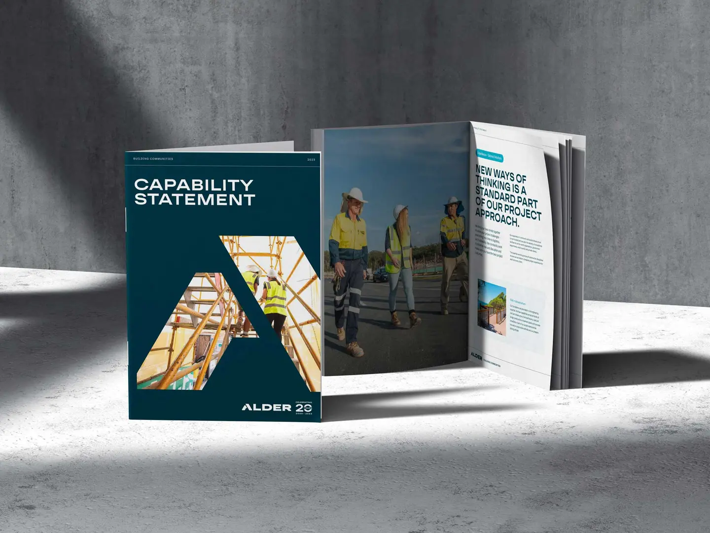
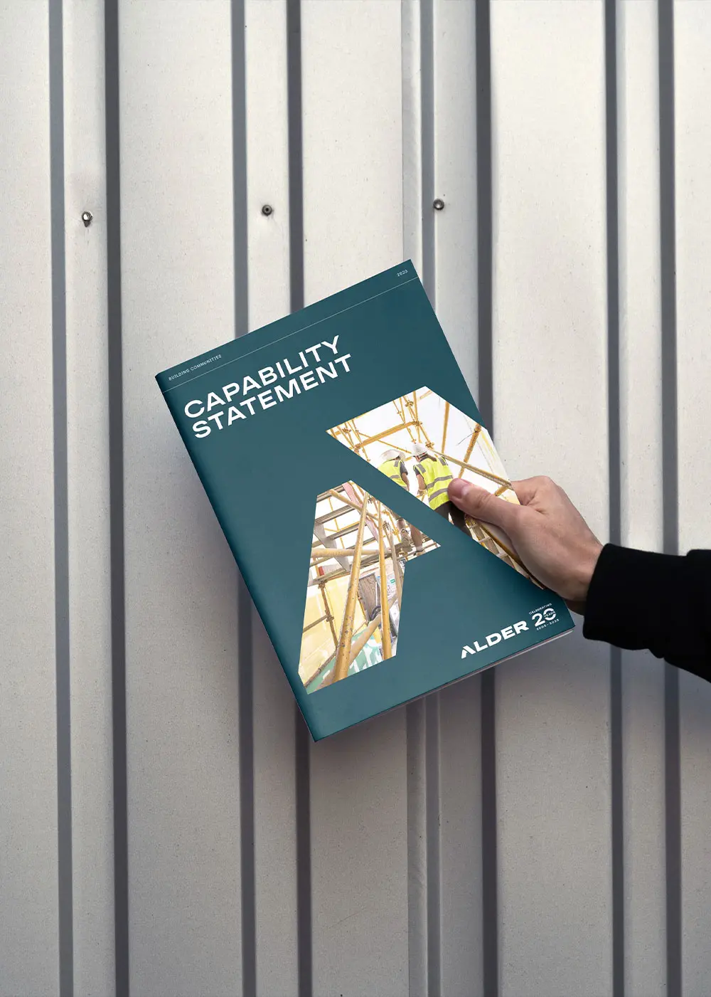
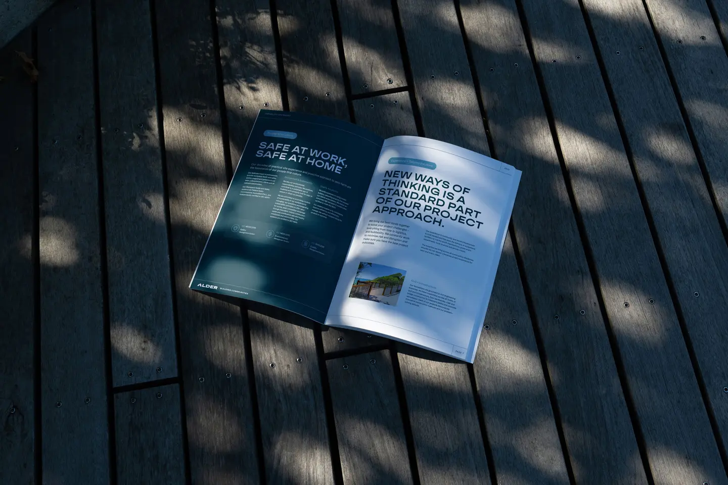
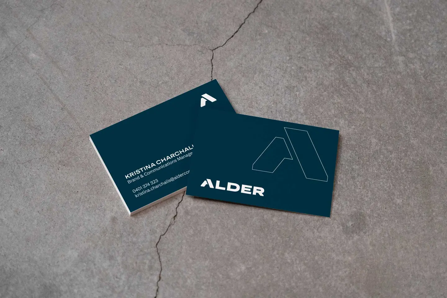
In crafting Alder Group’s brand identity, we focused on creating a strong, masculine aesthetic with capital letters and gave the feet of the sans serif font in the logo straight vertical edges. This design choice symbolises the strength and stability of the brand’s foundations, mirroring the quality and reliability in their building processes. Adopting a ‘branded house’ approach, much like Apple, we ensured the master brand influences the entire organisation. This cohesive strategy simplifies brand management and ensures every product and service aligns with Alder Group’s unified message, style, and vision, while still allowing sub-brands to express their unique qualities tailored to specific audiences. We chose a single colour palette for simplicity and sophistication, modernising Alder Group’s dated brand identity. This minimalistic approach ensures practicality and ease of use, allowing the new brand to be both functional and visually appealing.

Sophisticated simplicity: The colour and style of Alder Group's brand

We chose a primary dark teal blue to convey a strong, masculine identity. Fine line work and frames were incorporated to contrast beautifully with the bold brand elements, symbolising technical drawings used in pre-construction phases. This combination of colour and style reflects the precision and reliability that Alder Group stands for.

Case studies