-
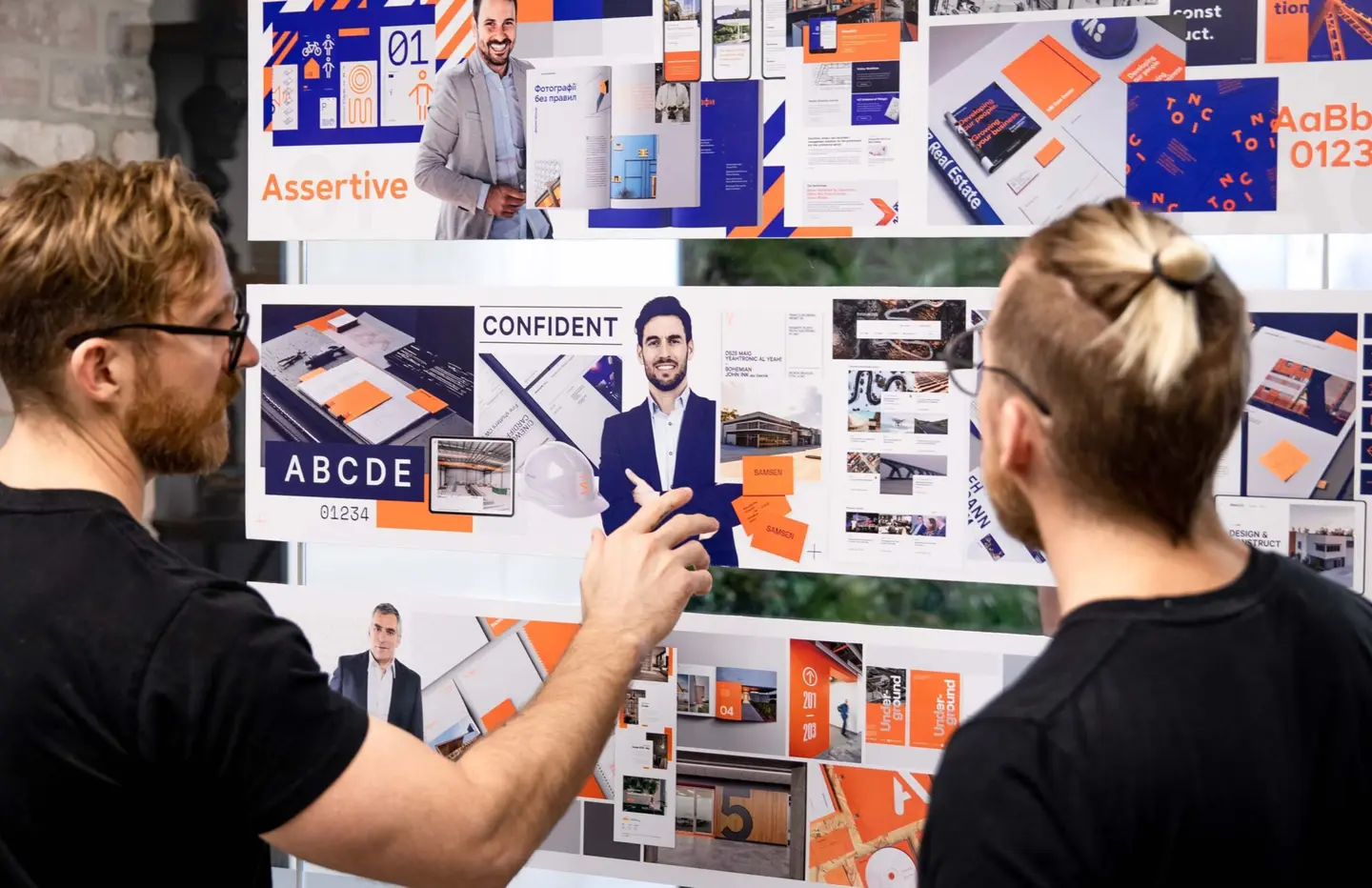
Elevating the visual and online presence of an award-winning construction company
Creative
-
Shaking up the payday loan market
Creative
-
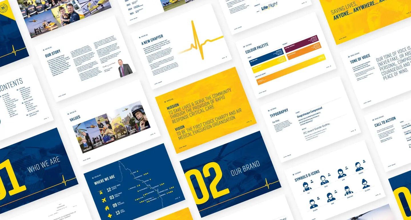
Executing a new brand identity for a mutli-facted aeromedical organisation
Creative
-
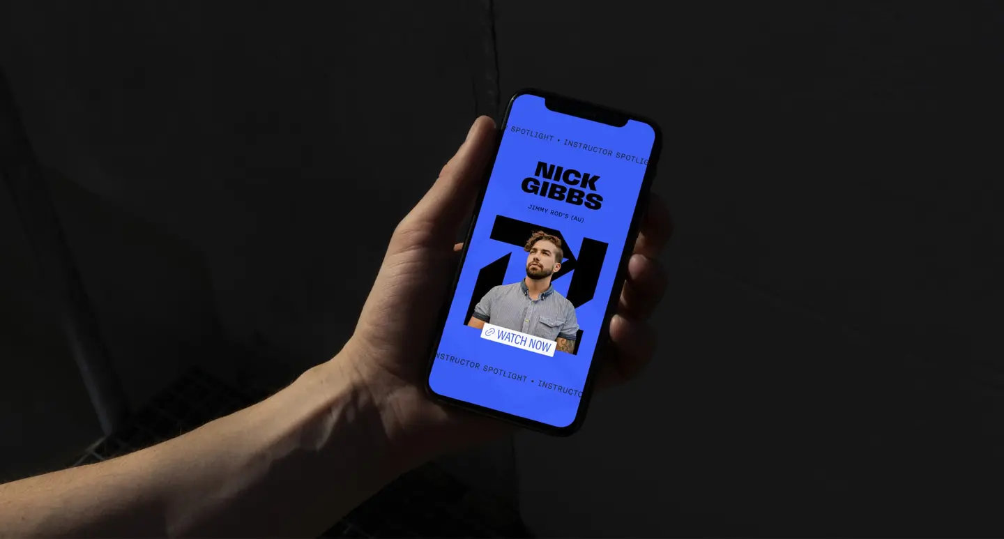
Creating a memorable brand to make waves on social media
Creative
-
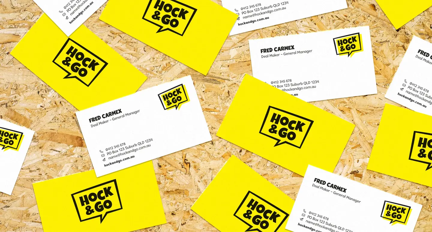
Breaking through the noise of a saturated market
Creative
-
Dymocks: Australia’s leading bookseller.
Creative
Data
Media
-
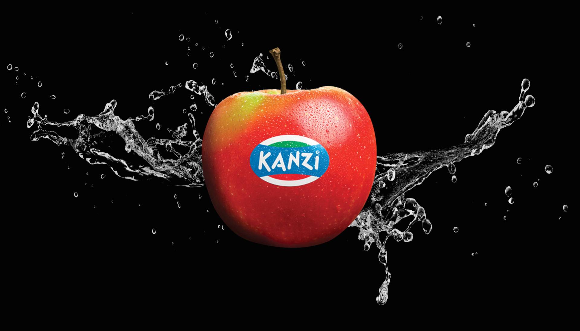
Kanzi Apples dominates the premium apple category.
Creative
Data
Media
-
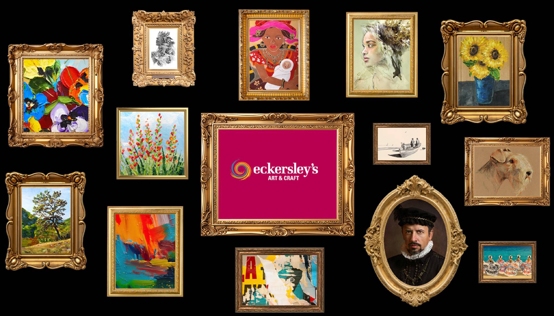
Eckersley’s supplies artists with everything they need for their next project.
Creative
Data
Media
-
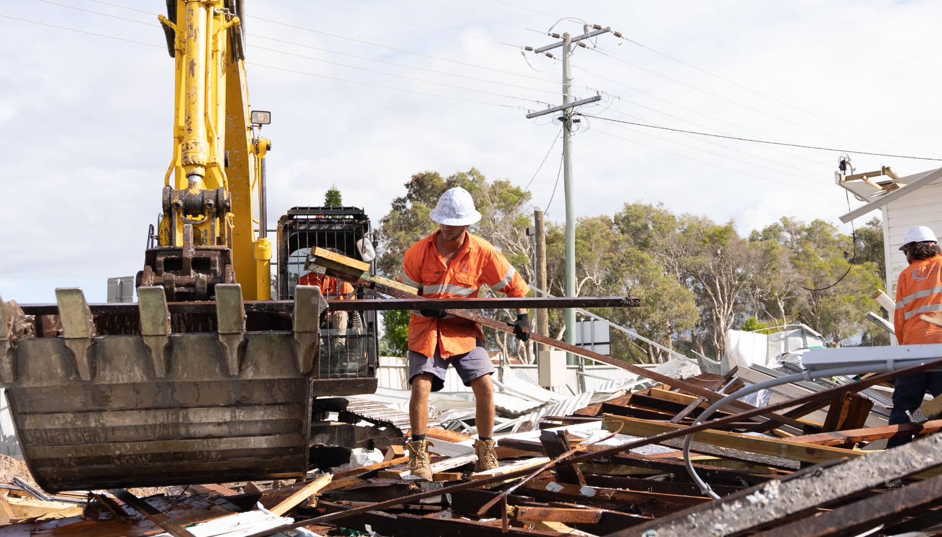
Coastal Demolitions provides sustainable demolition services in South East Queensland.
Creative
Data
Media
-
Phizz is the ultimate hydration solution.
Creative
Data
Media
-
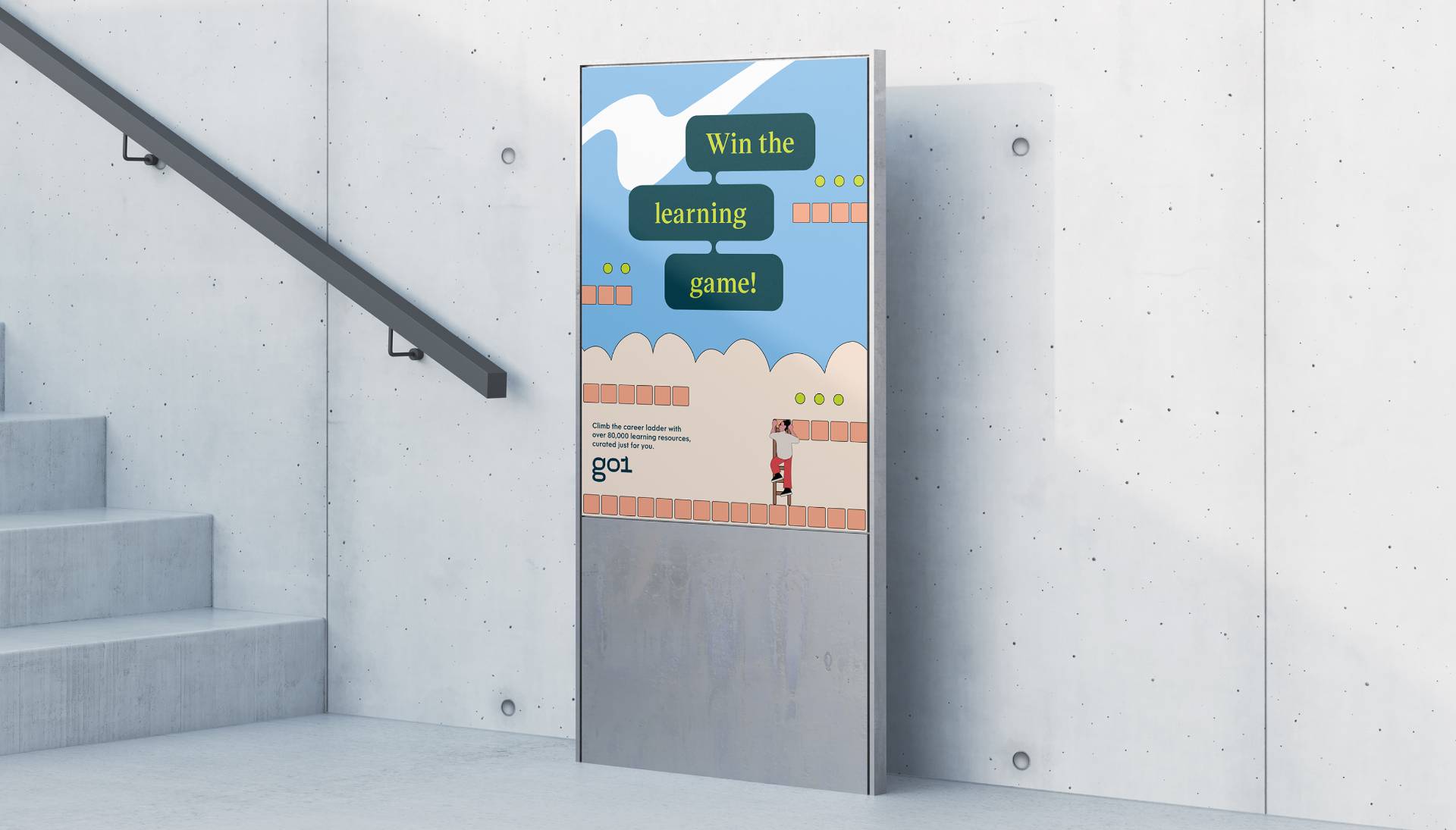
Go1 connects workplaces with a vast library of learning resources.
Creative
Data
Media
-
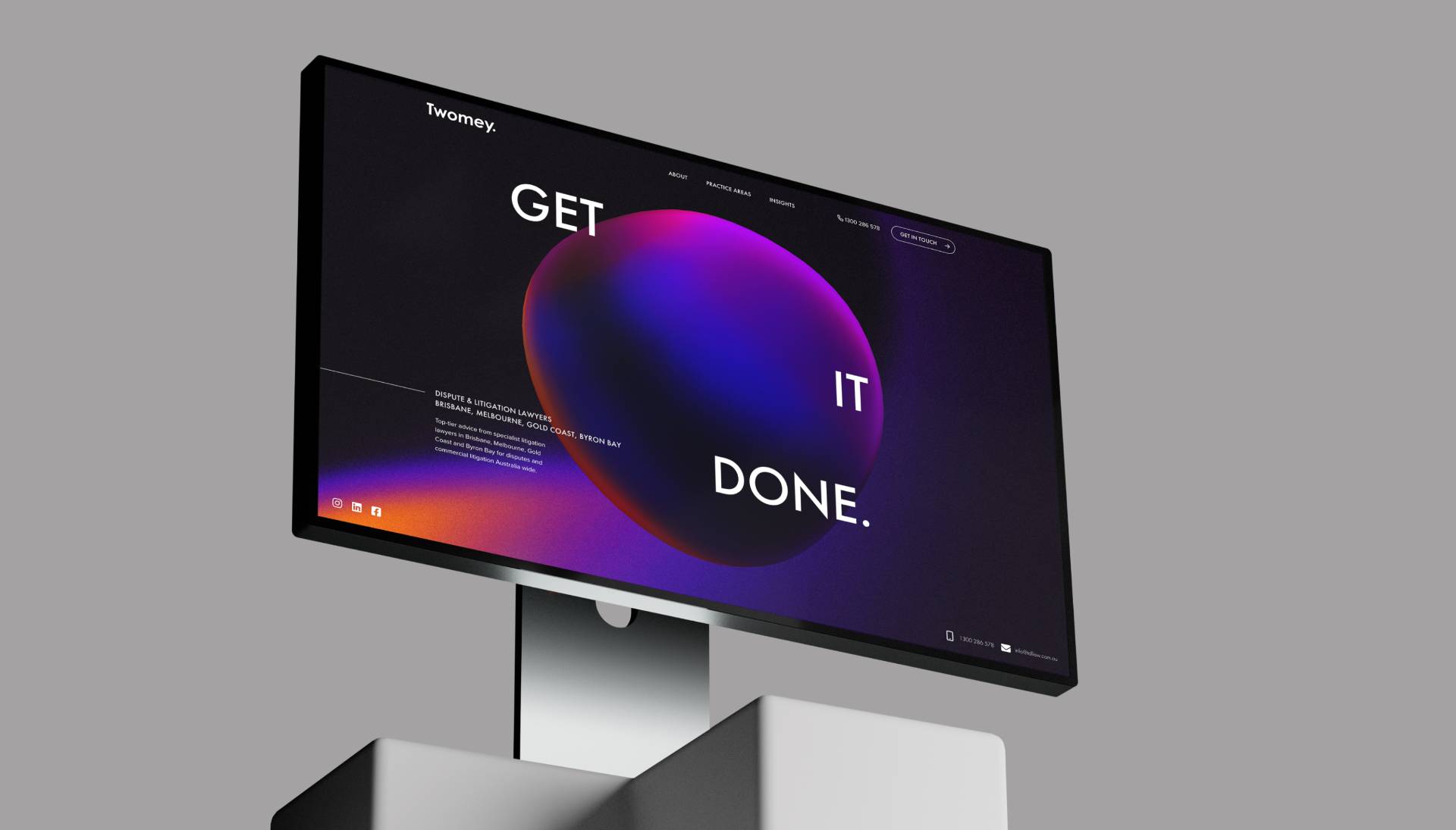
Twomey Dispute Lawyers combines powerful strategy and fluid agility with honest advice and a hunger to win.
Creative
Data
Media
-
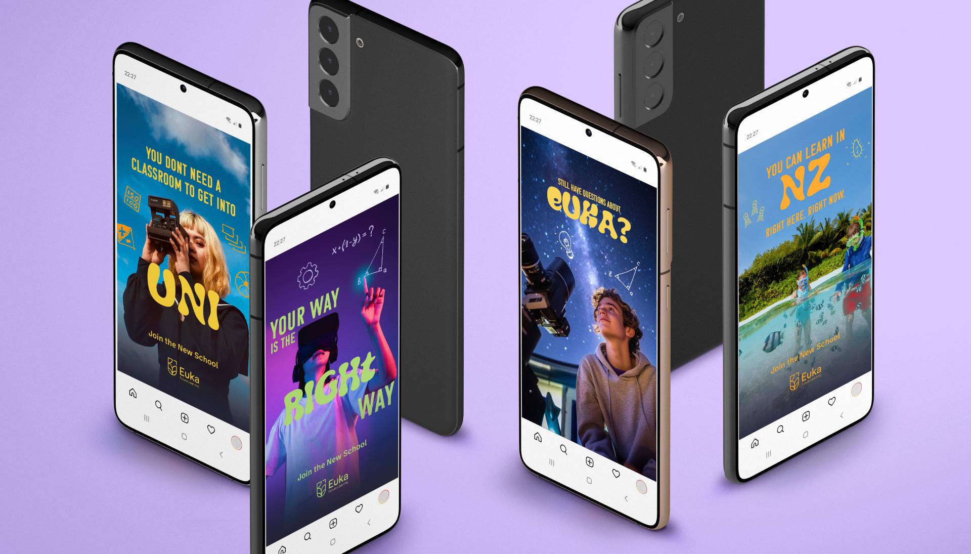
Euka Future Learning redefines distance education with a modern, flexible approach.
Creative
Data
Media
-
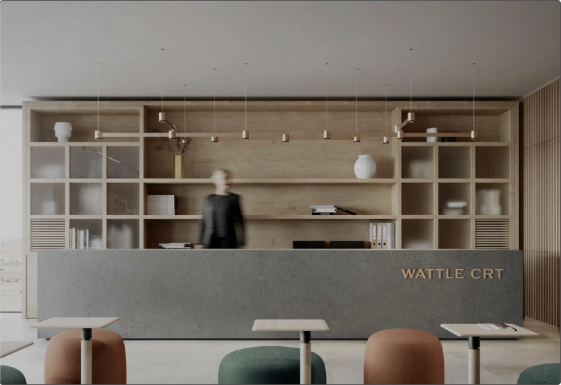
Wattle Court deliver high-end homes without compromising on quality.
Creative
Data
Media
-
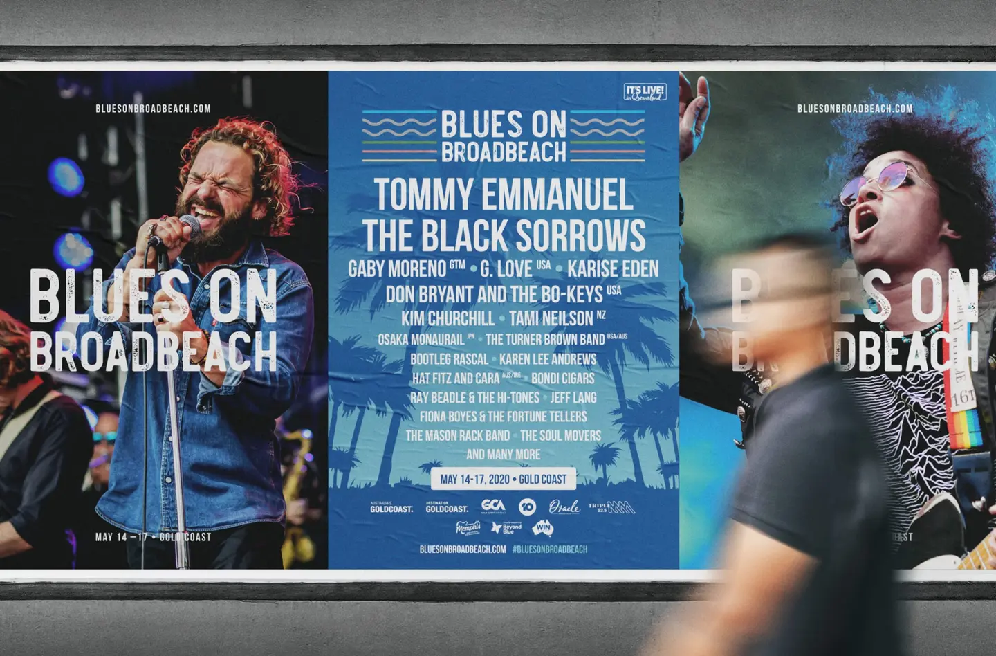
Branding for this iconic local music festival
Creative
-
Prioritising women’s wellbeing
Creative
-
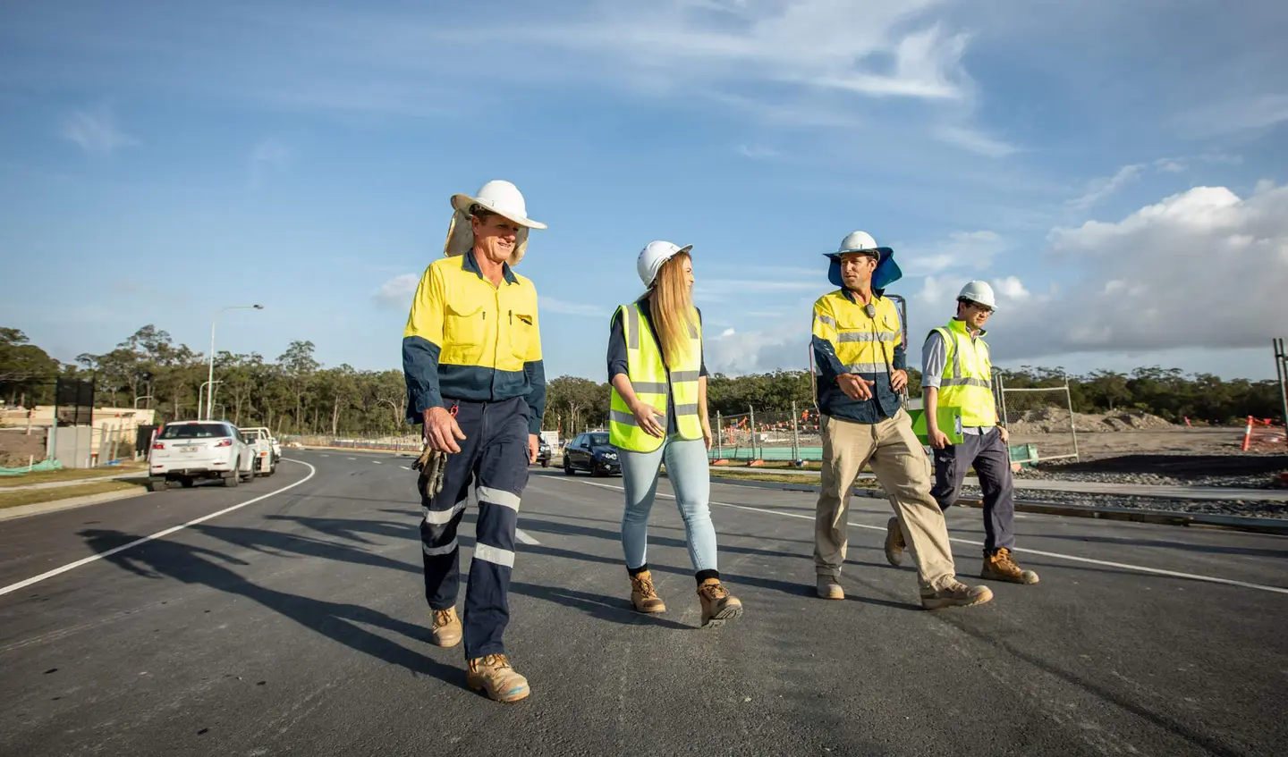
Alder Group is defined by its extensive experience in the construction and development industry.
Creative
-
Limitless Potential
Creative
-
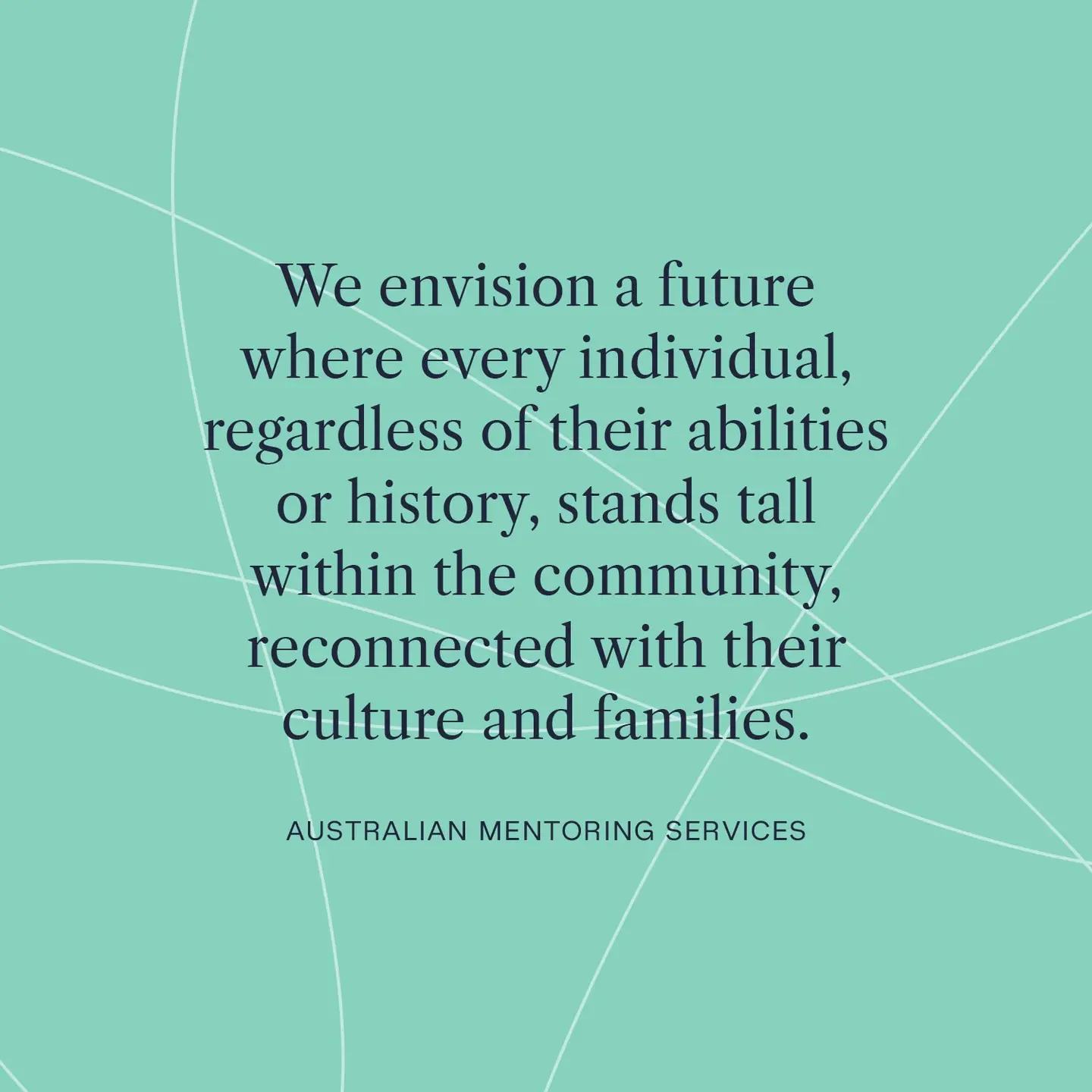
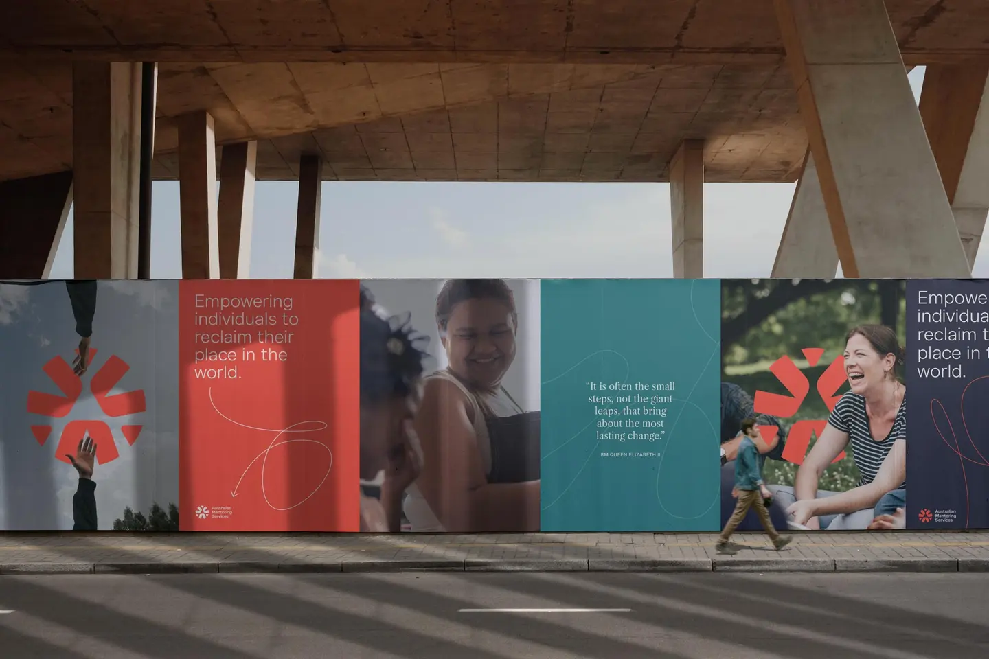
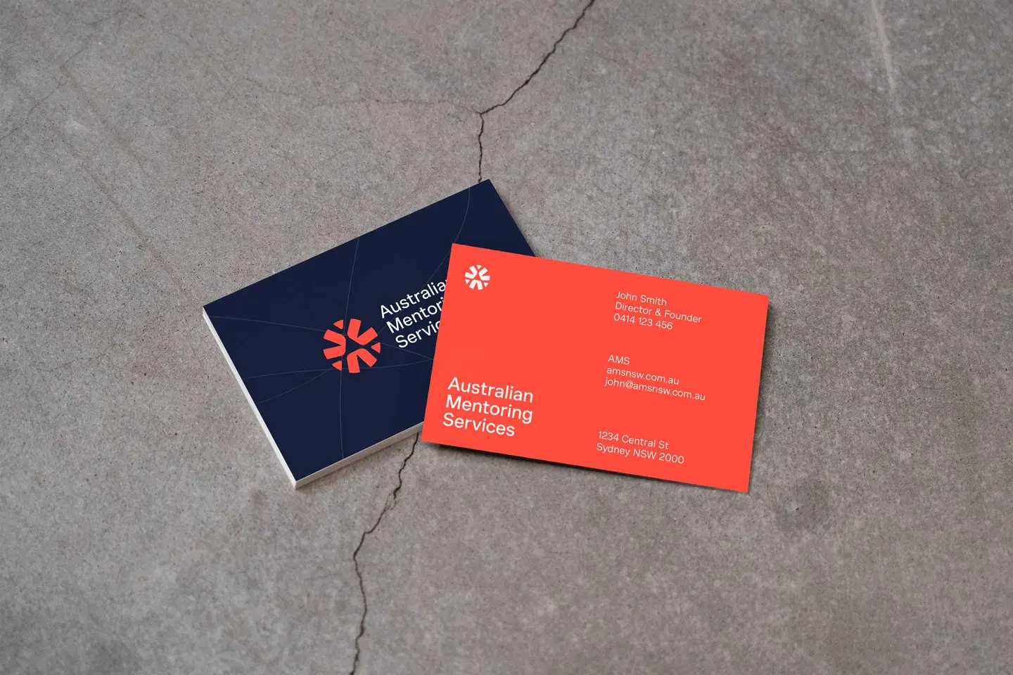
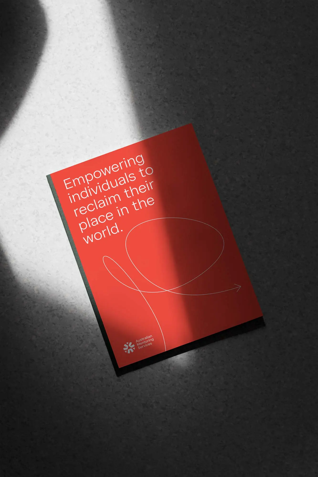
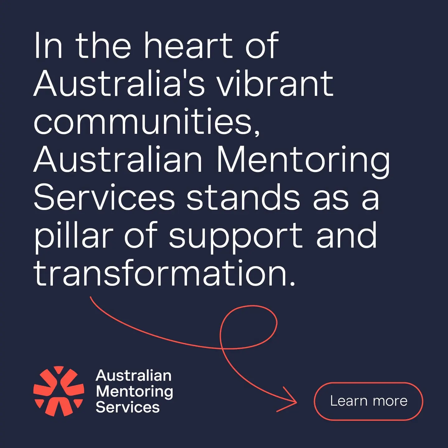
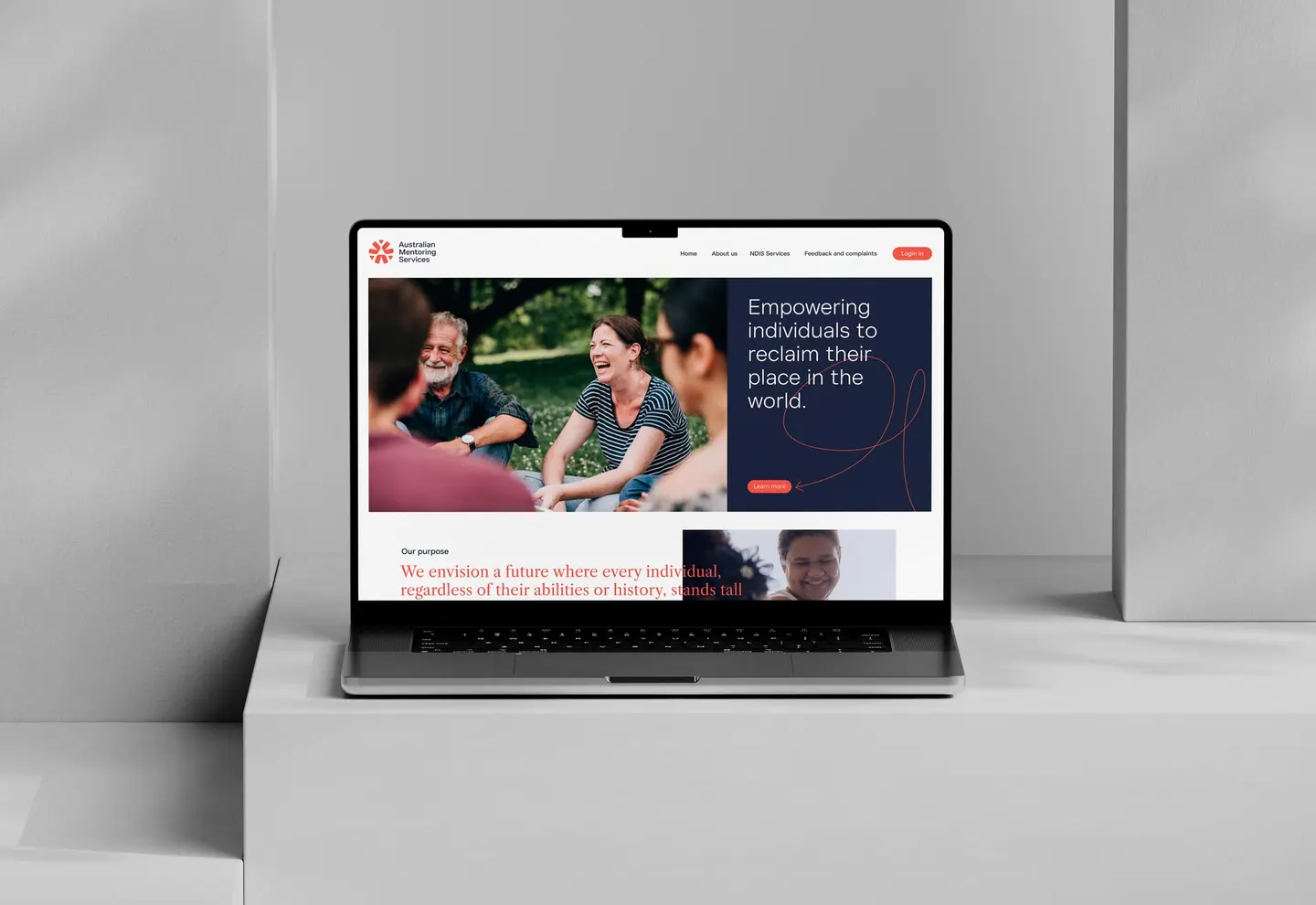
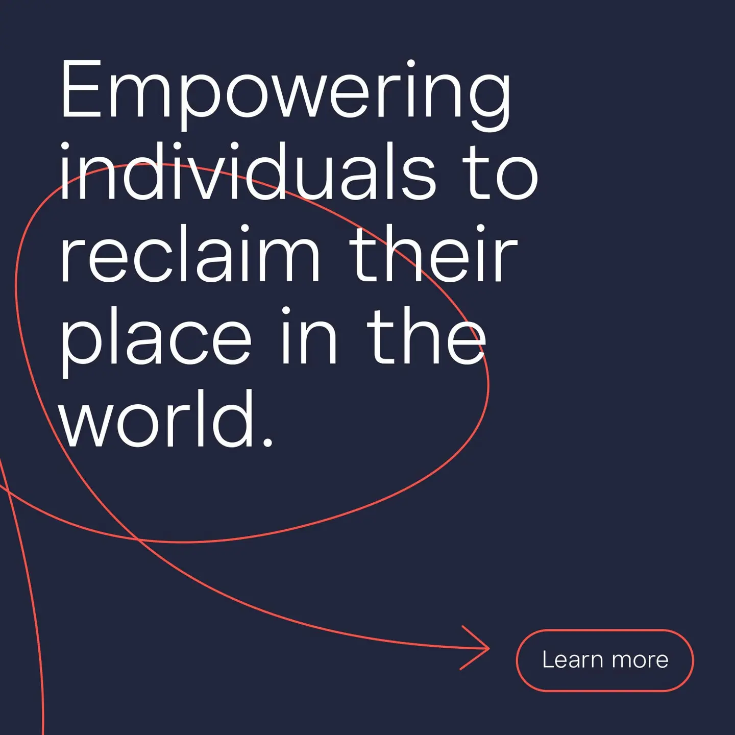
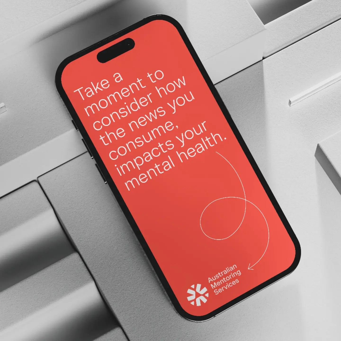
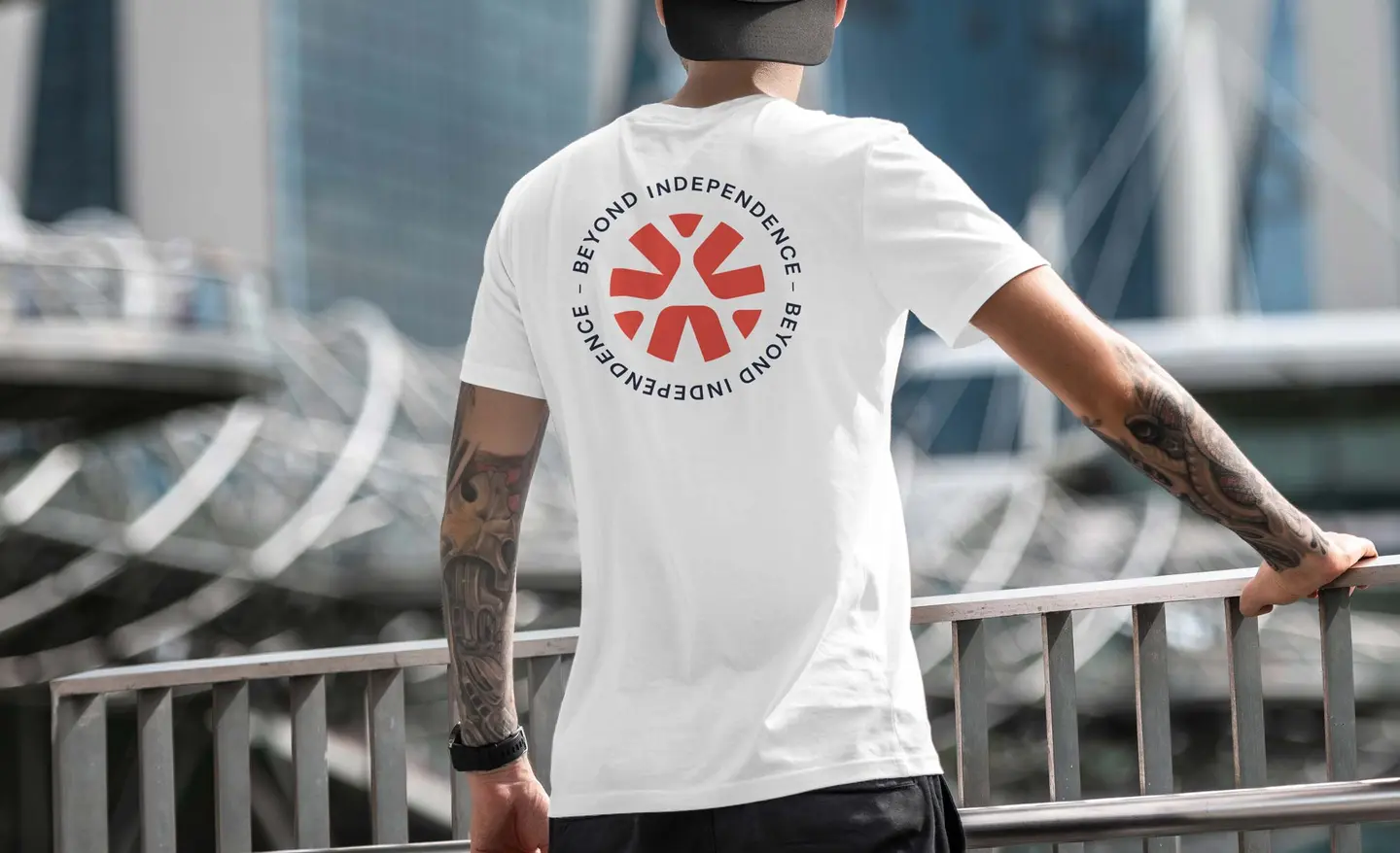
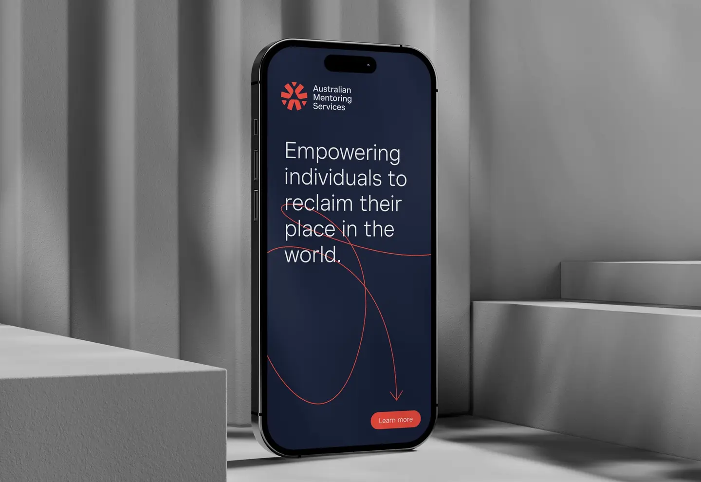
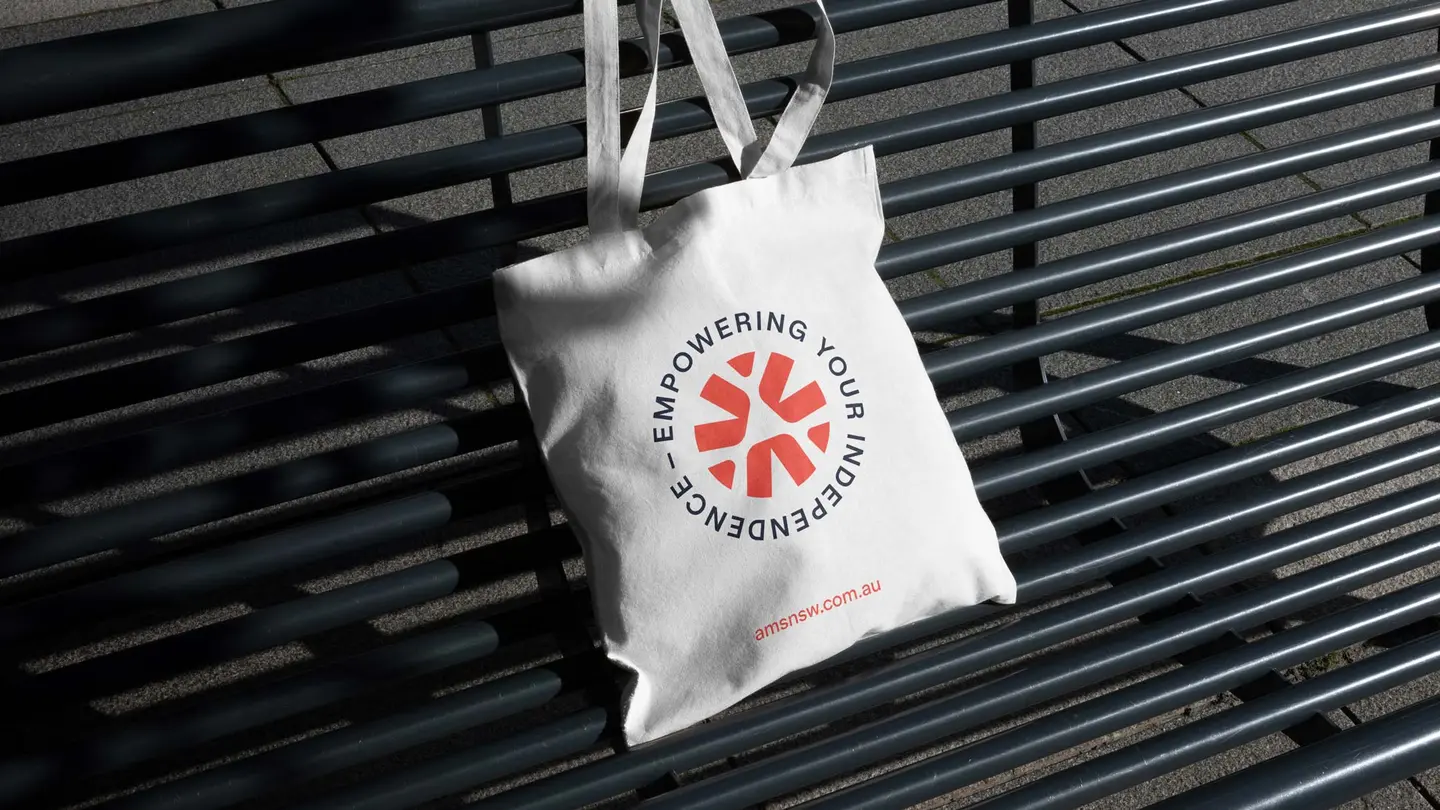
A beacon of hope
Creative
-
Master your indoors.
Creative