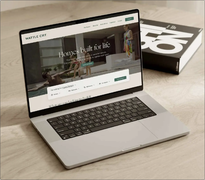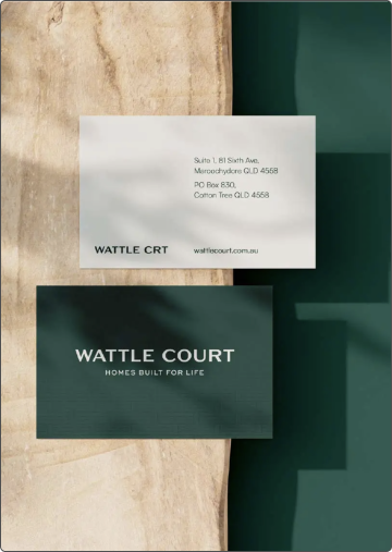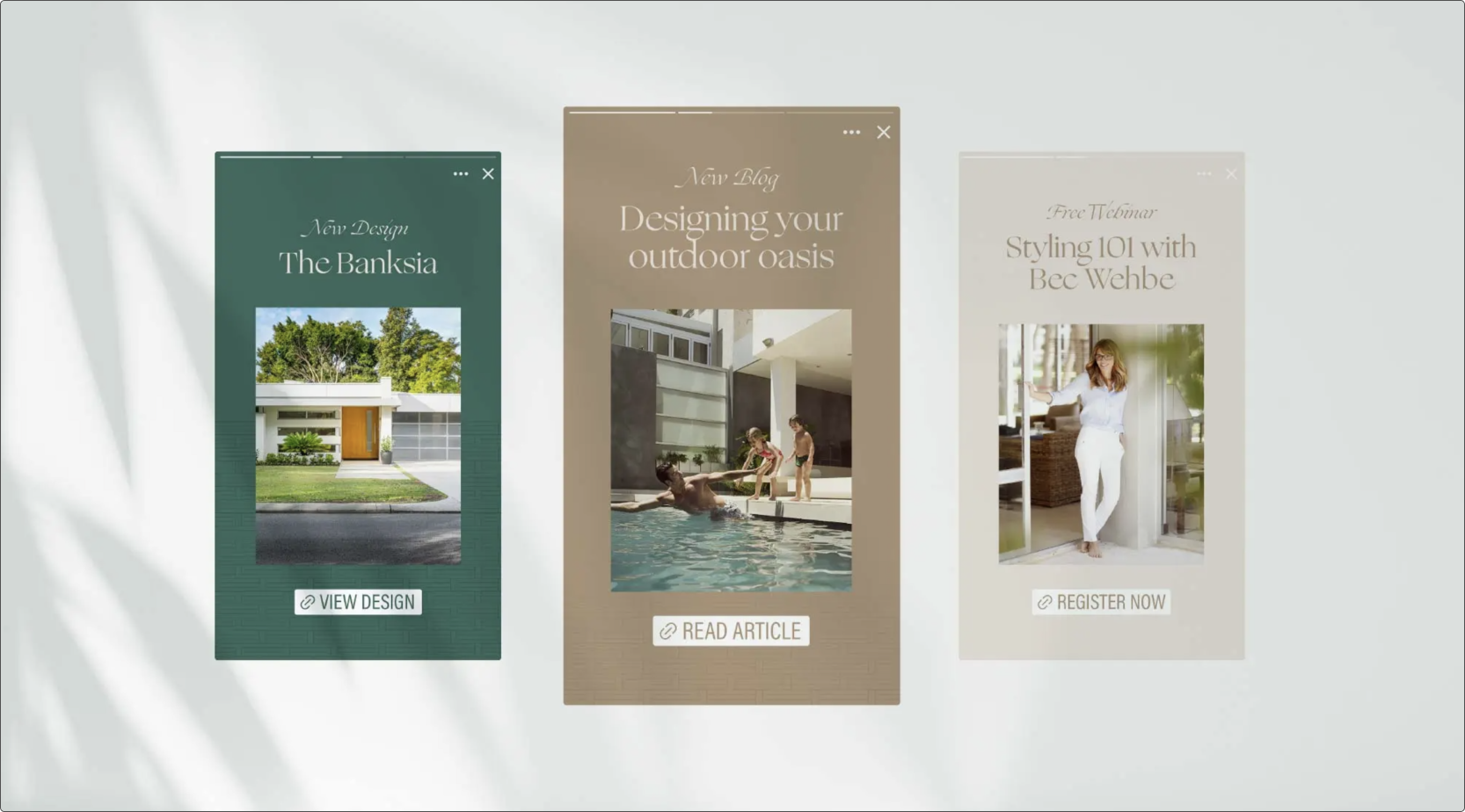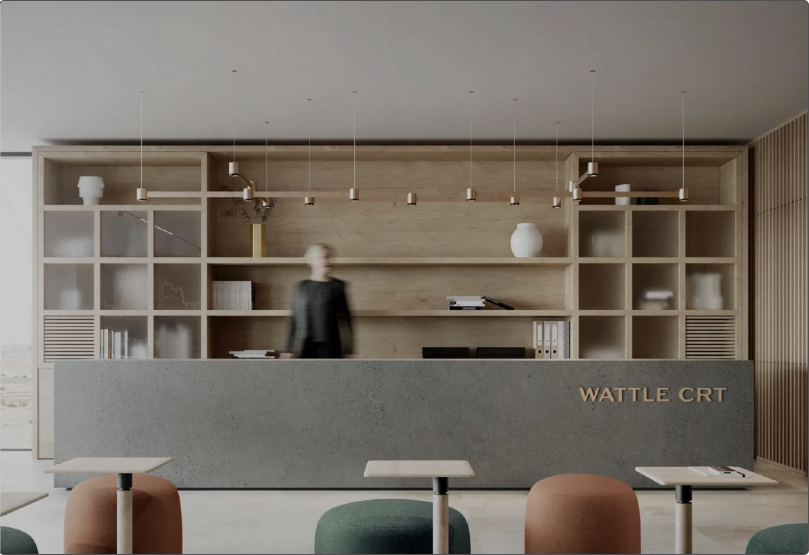
At Embark Agency, we had the privilege of partnering with Wattle Court to create a distinctive brand for their home builder franchise model. With a vision to become Australia’s leading franchise in the home building industry, Wattle Court sought to establish a strong brand identity that resonates with their target audience while securing a significant market share.
Our mission was to craft a compelling value proposition that not only sets Wattle Court apart from their competitors but also establishes a unique voice that aligns with their customers’ aspirations. Through this brand creation process, we aimed to reinforce their brand promise and build a solid foundation for future growth. Together, we have positioned Wattle Court to thrive in the competitive landscape of the Australian home building industry, offering a trusted and high-quality option for 2nd and 3rd home buyers.
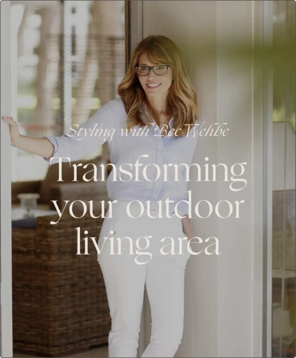

The term “wattle” originates from an ancient construction method used by early settlers, who interwove branches of the Wattle tree to build sturdy shelters. This concept mirrors our franchise network, where each branch, while individually strong, becomes even more formidable when woven together. The name “Wattle Court” holds personal significance, as it’s the street where I grew up in regional Victoria. The Wattle flower, Australia’s national floral emblem, symbolizes resilience, renewal, and new beginnings, much like our brand. Just as the Wattle tree is foundational to Australian heritage, our franchise builds strong, enduring homes and communities across the country.
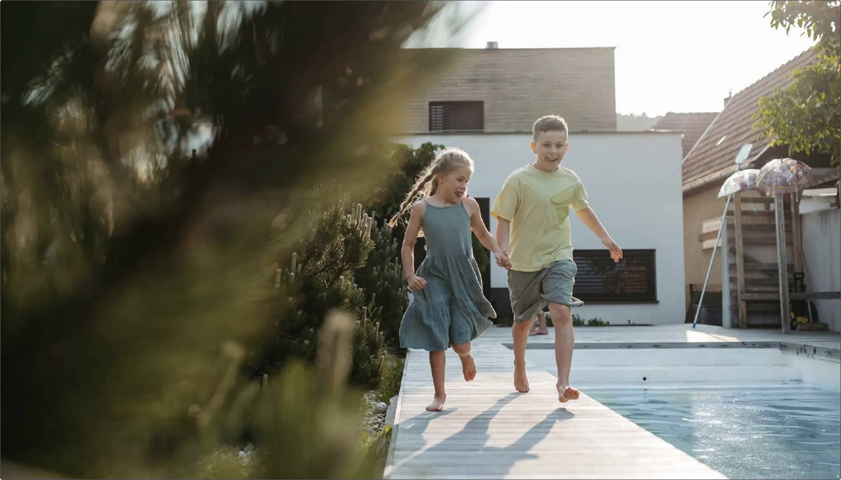
When designing the logo for Wattle Court, we made intentional decisions to resonate with our ideal audience—affluent buyers seeking sophisticated, high-end homes. The logo’s design is both sophisticated and simple, reflecting the understated elegance that our customers value. We chose an earthy colour palette inspired by the Australian landscape, incorporating shades of gold, dark green, and cream off-white to create a direct connection to the iconic Wattle plant. This palette not only evokes a sense of place but also aligns with the natural beauty of the homes we build. Additionally, the combination of sans-serif and serif fonts strikes a balance between modernity and classical refinement, ensuring the logo feels both contemporary and timeless. Together, these elements create a brand identity that speaks to quality, elegance, and a deep connection to the Australian environment.
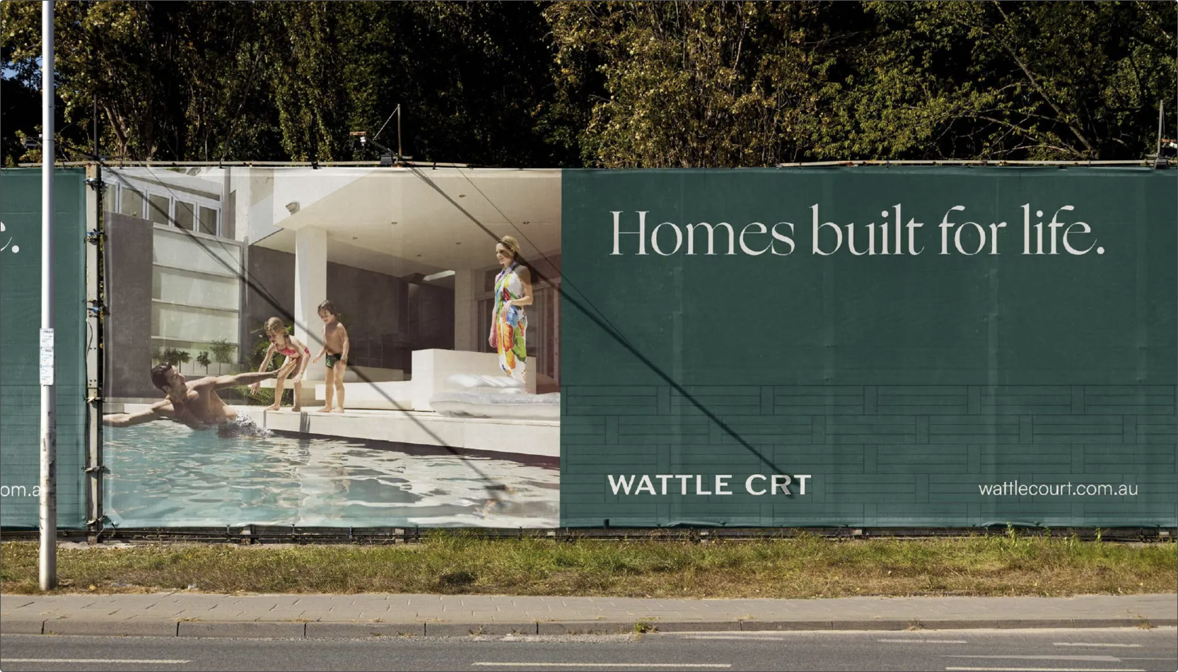
Embark worked on our initial brand development and website.The branding designs they created for us were bold and made a statement, but were also executed elegantly. This has given us a brand that our company is proud of and feels timeless, while helping us to stand out from our competitors. The website development is technically robust and I can tell will last us a long time, while giving us plenty of flexibility to update and adapt over time.


